Friday, 28 November 2014

Audacity with Mustang I amp

Today I finished a video made of many photos and short video clips. The last step was to add a guitar track. I figured it would be easy to use my iRig for iPad, but that involved downloading an app with a bit of a learning curve so I gave up. I need a track added today.

So I tried using the USB cable straight from my Mustang I amp to the Mac. Audacity didn't recognize it so I sought help online. It sounded complicated, to add drivers and get into some awkward audio settings in the Mac. Then I thought, now that everything is set up and hooked together, guitar and all, what if I just reboot the computer?

Macs are pretty smart. So is Audacity. And the price is right, for this open source software (free)!

When I opened Audacity, I was delighted to find that the audio input included my usual built-in microphone, and a Fender Mustang choice. I was shocked it was so simple.

When I selected the amp as the input device, and started recording and playing, it recorded the guitar and nothing else. Fantastic! I laid a few tracks. The only issue I've found is that the guitar was recorded at a fairly low level, even though the amp and guitar were nearly maxed out in volume controls. Some people have commented online with various settings that repair that or prevent it. 

Given this was my first try, I'm delighted with the results. I boosted the level of the tracks, exported to an AIFF file, and imported it as an audio track in Photoshop to be compiled with my video tracks. Next time the whole process will be easier and I'll produce something that I can show as a sample, and I'm excited to be making progress with my guitar playing too. I only started playing this year, after a few rough starts when I was younger, so now I can add my own guitar tracks when necessary. I've also got the hang of video editing in today's software, and getting more practice with making small video projects in my neighbourhood and family, almost on a daily basis.

Yesterday I took my new GoPro camera up Christmas Hill park, to get a view of the region all from one spot. It worked great, and that too has a learning curve. GoPro comes with it's own software to edit and prepare files. Given that the HD and better resolution files are relatively huge, I want to keep the process manageable on my basic iMac. When you open video files, and start adding music, voice tracks, and multiple tracks of annotation and animated graphics, the computer indeed does struggle to keep up. I'm grateful it doesn't actually crash, but one needs to be patient with huge Photoshop files.
Monday, 24 November 2014

Educational video graphics sample in progress

It's already been a few weeks since I studied an intense intro to motion graphics. I gathered some footage to practice with and decided on an educational roadside ecology lesson, that takes me back to college when I learned a lot about Garry Oak trees.

This project ate up my time today, in addition to going for a long walk in Swan Lake park that resulted in getting drenched during a moderate rain spell.

It's about 10:00pm and I'm still a bit damp feeling from that walk, while I work on my Garry Oak video clips.

I'm busily creating new samples of my recent interests like animation and motion graphics. This video may not need motion elements, because it's already filled with short segments of different features of trees, and I'm not adding any cartoon characters...or maybe I should!

It's all good practice. Adding and/or animating elements in a video, such as text overlays, requires a sense of timing and generally a sense of usefulness. I've decided that the audience for this sample video is 10-12 year olds. I don't have quick and easy access to lots of terminology about ecological and biological features of trees; college was a long time ago and I don't remember the specifics. 

A little animation may draw attention, without overpowering or dominating the visuals of the trees themselves. I'm most interested in practicing with the pen and brush tools to see if I can produce a line that connects the terms to the tree in an animated fashion. 

Luckily, with practice, the techniques I learned in the tutorial (off lynda.com) are getting easier and more precise, and they tie in nicely to basic graphic design principles I've also studied in the past, which keep me from going overboard with animation (hopefully).

I'm sure you readers will let me know if anything looks wrong!

Monday, 17 November 2014

Some screen shots from the action while making animated characters the past few days

I've uploaded the samples of a few recent simple character animations to YouTube, and wanted to show off some screen shots too, so you know what the Toon Boom interface is like. Some conversations online make it difficult to choose among Toon Boom Studio and products like Flash and Anime Studio Debut. I personally didn't like Anime Studio, and have never used Flash so I can't comment on any comparison yet.

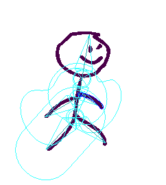
Here's a hint at what working with Toon Boom Studio animation software is like. First, a character with bones and "zones of influence":


A character following a "motion path":


Adjusting with cut-out animation tool:


And some screen shots of the interface while working with my stick figure:
'Zones of influence' for bones are visible; not sure what they do yet!

Leg 'bone' selected and can be rotated about the hip attachment point
Motion path with keyframes along the line spanning 5 seconds, at 12frames/sec

Timeline shows several layers are created to enable motion of each limb
The tricky part of using sophisticated animation software, it seems, is to use the right tool for each task, and select the right layer and timeline position every time, before making an adjustment. One suggestion to Toon Boom already: make icons bigger!!! It's very difficult to tell which view is selected, between Drawing View, Camera View, and the side & top views.

First character using Toon Boom Studio's cut out animation procedures

This is my first character more involved than a stick figure. I wanted to get more practice using cut-out animation, which differs from bone animation but I'm not sure to what extent. Bones offer more adjustment tools, it seems, and cut-outs appear rather quick and easy, with effects like my attempt below:


Stick figure walking with bones features in Toon Boom Studio

He's really getting somewhere now:

Busy with a variety of artistic media

It's hard to choose some days. I always start with at least two goals for the day, such as finishing a painting and doing a digital painting exercise. Any gigs I get off fiverr.com are done in addition to that, because I have a high drive for learning newer, better techniques than I learned way back in high school and days off during a long period of work and studies.

Last week, I decided to focus a little, however, and I set aside many drawing goals (ie. life drawing studies) so that I could try out some animation, motion graphics, and video compositing techniques I found tutorials for. I ended up downloading an animation software demo that lasts 15 days - Toon Boom Studio.

I've also completed a study in motion graphics that went from basic motion tricks to creating animated logos in Photoshop. I went on just in the past few days, to try to figure out how to add masks to videos, so that people can be highlighted or cropped out for example, even when they are moving around in the frame. Clearly, there's lots to be covered in my bag of interests.

So far a single activity hasn't popped out as 'the one' that I'll prioritize in my personal and commercial pursuits. In the past few days, my animated stick man has gotten more sophisticated, and so has my video masking. Meanwhile, all of those activities require keeping my drawing skills keen. Thus, tonight I set aside most of the computer activities and started a simple watercolour painting exercise using my favourite subject, cats, to try out some quick colour decisions and glazing techniques.

I just wanted to write to keep you interested, and know that I'm not falling off the radar. I have taken a bunch of photos and computer screenshots and need to sit down, organize them, and post them with useful stories about work in progress and my reviews of techniques I've learned recently.

Also, one drawing has been chosen to appear in a group show at Pandora Arts Collective later in November. It's the Forest Kitty ink drawing I previously blogged about. I'm excited about that, and to see the work of my drop-in art group peers on display together.

Happy graphics/video/animation/painting everyone!

Tuesday, 11 November 2014

More stick figures; looking for tutorials to optimize Photoshop animation for 2D characters

I made a few more stick figure animations today, shown below. They were fun, and I'll continue to apply my cartoon-drawing dreams to Photoshop as my preferred animation tool until I can find a good reason to take on an animation software (and all its necessary learning) such as Toon Boom. I also have Blender installed for free 3D animation experiments, so I'm not bored yet.

I would like to be able to do rigging, rather than relying on Photoshop's puppet warp tool for doing character movements. Still, I think puppet warp forces me to really pay attention to gestures and biomechanics (both are personal interests in terms of their related sciences and social sciences), so I'll enjoy the experience.

So far I'm relying on 3D animation literature (old textbooks, and software-specific tutorials) to learn the concepts of keyframes and tweening that I'm using for the stick figure animations. Animated logos are so much easier - Photoshop's tools are designed for manipulating those quite nicely. It's just a little harder when your graphic is a character drawn with the paintbrush tool and a Wacom tablet.

With the tools I've got, I think there's no reason my next animation session couldn't include my cat cartoon characters. After a bunch of that drawing practice, I may want to move into a pro animation software and possibly the 3D side too, perhaps starting with Blender (free).

My choices are open to nudging by clients who may need specific animation and video effects that one software or another excels at. Of course, I'm not just drawing for fun. I want to do animated or semi-animated videos for other peoples' promotions, events, or stories.

Tell me what you think of these ones, and any suggestions you have for a logical next software to try out. Keep in mind I can't afford or justify spending $2,000 or more, for professional versions like Toon Boom or Maya.

Version 2 of stick figure:
And version 3, with more frames and 'tweening':
Ok...I didn't like the ghosty effect in version 3, so I made a version 4 with shorter frame duration and no 'tweens':


Sunday, 9 November 2014

Comments, please?

I've gotten no comments on my blog posts in recent months. Well, actually, I've gotten zero comments in this blog's entire history.

So, I added a Facebook page where I hope people will be more open about sharing thoughts. Comments are open to any Facebook users and the general public can see the page as well.

Saturday, 8 November 2014

Photoshop animation experiment worked - stick figure and tweening

I've gotten a lot of ideas for simple animations lately, mostly involving cats, no surprise. I heard many times that the video tools in Photoshop also work for single frames and the "tween" feature fills in between the frames to make them appear animated.

I wanted to be sure at least basic animation could be done with the Photoshop I already own, so I created 4 frames with the brush tool then looked at them in the video timeline. At first I couldn't figure out how to animate them, and fill in frames between their poses. After some pasting and fiddling with features I learned in a video editing tutorial recently, a few seconds worth of animation and tweening appeared.

I'm not sure why the ghost effect appears but I'm pretty sure it can be turned off. I have some other projects on the go that need to be finished so this was the result without too much fuss (maybe an hour's worth of trying different arrangements and tools):


As you can see, Photoshop does indeed allow quick and dirty animation to be done. I'll be a lot happier when I grasp the video and animation tools better. My goal is to add animated line art and possibly whole characters to my video projects. This is why I've been practicing watercolour, pastel, and charcoal drawing, and practicing with my new Wacom tablet. I like the idea of splicing or pasting in different hand-made effects into digital modern video recordings (websites too), to create an engaging story.

I enjoy making art, of course, but animation for websites and videos is the real application I want to excel at, for making modern low-budget but invigorating short promotional videos for non-profit agencies or sports teams, and similar.

As soon as my skill evolves, I'll be sure to share the news and examples here and on my YouTube channel.

Friday, 7 November 2014

Trying out Elgato video capture device for Mac

I can't believe it. I have been looking for a way to capture video on the computer from my old home movies on VHS and camcorder tapes.

I tried using a dazzle but mine was meant for windows, and I couldn't get any of the unofficial workarounds found on YouTube to work. Apparently there is a version for mac but i couldn't find it anywhere.

To my delight while searching today I found the Elgato device, and it was available from London Drugs, and in stock half a block away from my home!

I opened the box and the obvious cables were in there, along with a CD with capture software and instructions printed on the inside flap. I'm used to devices that are difficult to set up. This device was very easy to set up!

At the store, I was a bit concerned about quality. It captures at 640 x 480 and I hoped that was adequate. And I thought the HS is not that great of quality anyway, and the next quality up is for hardcore gamers and quite a bit more expensive over $200. This device is just over $100.

I'm just in the process of going through a tape right now to capture it, & I will keep you posted with any news and reviews about this device.

My goal is to capture my home movies so that I can practice my newest video editing skills on them. I started video editing as a child working on home movies as gifts, and I feel very confident that I will enjoy video editing for gifts again as an adult.

Right now I'm following a tutorial series on using Photoshop for video editing special effects animation. It's going really well. I have learned how to make graphics move in and out of a video sequence, and make animated logos for my video introductions! I found the tutorial lynda.com, no surprise. It's excellent quality and covers more...much more... than I've ever learned in any of my books or classes.

Check out my initial sophisticated setup:

Wednesday, 5 November 2014

Website antics today; problem with SSI (server-side includes) already solved

While keeping up my drawing and painting skills, I'm also making progress on a website that serves as a sample of my HTML skills. The site (of course still in progress) is patiostudioproductions.biz.

My notes below are shared for people who may have the same problem I had with using server-side includes in my HTML files.

Today I worked with server-side includes for the first time in my life.

SSIs allows repeating elements like navigation bar and footer to be created once, and included in every page. My web host Freehostia.com allows SSIs and now that I've got it working, I'm grateful because apparently not all web hosts allow it.

It's an alternative to using templates like you find in fancy software like Dreamweaver. I don't use Dreamweaver so I can't use templates. There are other alternatives such as using PHP but I'm not aware of how to do that yet, so SSI is my faithful companion for having consistent repeating elements in all my pages.

Here's the line that includes my navigation bar to appear in all the pages at patiostudioproductions.biz:

!--#include file="navbar.htm" --

While following along in my big Missing Manual: Creating a Website book, my nav bar wasn't working correctly. My nav bar links would show up as the expected list of pages, but each link would go to a 'page is missing' notice.

I thought I did everything absolutely correctly.

It turns out, I did, and here's how an error creeped in without my awareness.

First of all I'm using a Mac. I use Blue Griffon as my HTML editor, and TextEdit for editing CSS pages.

To work with a SSI, I needed to create a separate HTML file for the navigation bar information - just three links that go to 2 pages and 1 bookmark in my site. Previously I copied and pasted the links into every page. I inserted the #include statement shown above.

At that point, links showed up but were leading to error pages.

I looked at the navbar.htm file closely. Just three links. No problem there, I thought.

I compared my two pages line by line and noticed a missing DIV tag. So that helped a little. When I manually typed in the address of the page, it looked a little weird to my surprise, but putting the missing tag in solved THAT problem.


Still, my nav bar wasn't working.

Again I looked at the navbar.htm file in TextEdit. The reason I needed a plain text editor for this is that Blue Griffon automatically places HTML and BODY tags, etc in the file whether you like it or not. Files that are going to be #include'd mustn't have those tags, so I created it with my Mac's basic text editor, TextEdit. To edit the file without introducing any tags or text formatting elements, I found the best solution was to simply rename the file as navbar.txt each time to open it in text mode (rather than RTF document mode). Then, just before uploading, I'd rename it as navbar.htm.

I had opened and closed the navbar.txt file several times, trying to make sure I had no spelling mistakes, etc., since it wasn't looking right once uploaded.


See if you can see the problem.

There's a problem there alright...but I've never noticed it before in other contexts!

Version A

Version B


One works, and the other doesn't. Which one is the correct one? Interesting, huh?

Well...maybe you noticed the error much sooner than I did. It's the quotation marks. Version A works. Version B doesn't recognize the Home link because the file name isn't technically surrounded by quotation marks. Just after the file name on the 2nd line, the closing quote mark is the curvy/slanted style used in word processors. When I copied and pasted the straight up-and-down style quote marks from elsewhere, the file worked perfectly.

If only I'd known. I wasted an hour copying and pasting before I noticed this finicky problem.


Now look at A versus B again. 

Those curvy quotation mark stands out in version B now!

As I said at the beginning, I'm sharing this to help people in a similar circumstance solve the problem quicker than I did.

Monday, 3 November 2014

'Cat on path' drawing took a lot of time and involved a lot of ink

I completely neglected to blog as I was creating this one, over a period of about 3 days. So here it is. It's one that already I am arranging to frame and hang on my wall. It seems worthy of trying to sell on ebay some day, or my local shopping site usedvictoria.com.

Here's a quick look at the finished piece:

Forest kitty ink drawing by Heidi Bada

A few points to remember about my artwork


  1. All images anywhere on my blog, stores, and other online or print locations are copyright protected. I'm shocked that people these days think they can use peoples' drawings and photos in their ads. It doesn't matter that a (c) copyright symbol isn't present. Please spread the word that you need consent to use other peoples' images in your ads, signs, flyers, websites, and so on. I'll stop the lecture there.
  2. I'm looking for feedback and of course let me know if you'd like to buy a print. My next step is to upload it to my FineArtAmerica and Society6 stores (Society6 seems to have cheaper shipping but I'll leave it up to you to decide). 

How this image evolved

Since the piece is completed, I'll give you the whole story with my recollections.

First, I thought I wanted a sweet little forest scene with munchies for the cat. I sketched on scrap paper to get the figure close to real life proportions, and wanted to keep that cute little face that appeared even though it seems like it's straining to see something off to the side.

Basic cat on a path surrounded by weeds
I thought a cat on a plain green background would be boring, and I saw an opportunity to make a foreground of encroaching branches. I was also trying out a potential maximum for the reach of the grass, represented by those yellow bushes in the top region.

Grass and leaves added
I'm pretty sure I didn't like what I saw. I wanted to see what the sky would actually look like, not knowing how dark my new blue ink would dry. Yikes! It's pretty opaque and medium-dark.

Sky and rocky foreground started
Going on my idea of leaves, which at this point weren't standing out very noticeably, I also discovered the bottom region needed a foreground too, as an environmental cue that the pathway is an opening for your eye into the picture and perhaps adventures of this kitty cat.

Now a step back to see some balance in the image
I seem to have gotten quite involved at this point, and didn't snap any more cell phone photos. I really wanted a bright cat, with an inviting environment to explore. Given the sorta dark sky, I started to sense an evening time for this image. 

I smoothed out the grass and the rockery to match the even tone in the sky. The cat's colourful coat required several...coats...of ink to cover the area and allow some highlight variations while I also had yellow on my ink palette for doing the green grass and leaves. While the leaves ended up brighter than the grass, they actually stand out as an eye-catcher for the cat's yellow eyes I think.

The land unexpectedly started to look like it was rolling off into a valley at left. It reminded me very much of rolling hills along the roadside in the interior region of B.C. where I've travelled.

I thought I'd leave the ink work done here, with a viewer wondering what the cat is thinking, what it's looking at, and where it might be located. I think the bright leaves indicate the location might be close to streetlights or houselights, and it seems cozy to me.

Finished now


Saturday, 1 November 2014

Working on a cartoon skiing watercolour today with Aquarelle paper

It's my first time using Aquarelle watercolour paper. Right now I'm just waiting for an initial blocking of colour to dry. It's my cartoon character Fuzz in a ski scene.

My last few drawings were ink, and even though I just bought a few more ink colours to make tints and shadows easier to complete, I feel compelled today to revisit my interest in watercolours. Depending how the painting turns out, I may add some illustration using ink as well, but ideally I will control the paint enough with several washes to make my cartoon character pop out of the scene.

It's an action scene, just like I used to draw as a teen, and in college too I recall. This is my most-frequently-doodled character in my school notebooks. He doesn't look like a stunning dude so far, but let's hope my watercolour skills give him some stature by the end of this painting exercise!

Fuzz Skier watercolour in progress
Notice the painting support is my trusty Sterlite plastic bin lid. Works every time, and protects my work table that also serves as my fine dining table.