Showing posts with label Photoshop exercise. Show all posts

Sunday, 7 December 2014

My first HTML5 animation was a success, now visible on Youtube and my website

After some experimenting with the capabilities of Hype 2 on the Mac, I came up with a short animation about Christmas and cats that I have shared on Youtube at http://youtu.be/ITsWH0Rzigc and on my website www.patiostudioproductions.biz. Full audio is only included in the website version, because exporting to video doesn't seem to include audio.

Let me know what you think, there or here in the comments.

Here's the YouTube version, but it's better to see the website version because it utilizes the audio files and original HTML and graphics files.


Now that I know Hype 2 works well, and is very easy to use, I am excited to come up with more compelling stories. I can justify putting time into complete cartoon or line art illustrations, with suitable components to be animated with HTML5 and Javascript. For my samples, I am planning to make a few educational and entertainment pieces. My college and university studies offer lots of enjoyable subjects to choose from, that I'll try to show in a funny or unique (but compelling) way. For entertainment, I have a few cartoon characters that I draw frequently and would love to portray in animated stories. Not to mention promotional animations for my own and others' websites.

It's exciting, especially after I decided Madefire's online animated comic book creation tool seemed to have an unnecessarily dark and mysterious learning curve. My project there failed three times, and I say that's the end of that!

Madefire out...Hype 2 in. Plus, Hype 2 creates HTML5 assets ready for FTP upload. I've never used an FTP client before, but on short notice, and strong desire to show off my Christmas cat and tree animation, I figured it out (using FileZilla) and it worked perfectly. The first and only thing you'll see on my 'practice' website space (www.patiostudioproductions.biz) is that cat and tree animation!

Monday, 24 November 2014

Educational video graphics sample in progress

It's already been a few weeks since I studied an intense intro to motion graphics. I gathered some footage to practice with and decided on an educational roadside ecology lesson, that takes me back to college when I learned a lot about Garry Oak trees.

This project ate up my time today, in addition to going for a long walk in Swan Lake park that resulted in getting drenched during a moderate rain spell.

It's about 10:00pm and I'm still a bit damp feeling from that walk, while I work on my Garry Oak video clips.

I'm busily creating new samples of my recent interests like animation and motion graphics. This video may not need motion elements, because it's already filled with short segments of different features of trees, and I'm not adding any cartoon characters...or maybe I should!

It's all good practice. Adding and/or animating elements in a video, such as text overlays, requires a sense of timing and generally a sense of usefulness. I've decided that the audience for this sample video is 10-12 year olds. I don't have quick and easy access to lots of terminology about ecological and biological features of trees; college was a long time ago and I don't remember the specifics. 

A little animation may draw attention, without overpowering or dominating the visuals of the trees themselves. I'm most interested in practicing with the pen and brush tools to see if I can produce a line that connects the terms to the tree in an animated fashion. 

Luckily, with practice, the techniques I learned in the tutorial (off lynda.com) are getting easier and more precise, and they tie in nicely to basic graphic design principles I've also studied in the past, which keep me from going overboard with animation (hopefully).

I'm sure you readers will let me know if anything looks wrong!

Saturday, 6 September 2014

Results of fog exercise, adding fog to a skateboard still life photo

I found a fog-making Photoshop tutorial that looked promising and I really wanted to try it. I really wanted to add some doom and gloom to some of my photos. I found one photo that definitely needed a dramatic enhancement, shown below.

Original skateboard with grid spot flash accessory

This photo was the result of some tests using a grid spot flash attachment, which was a new accessory to me. I love the strange lighting effect it produces: flat yet vibrant.

Working through this tutorial, on the tutsplus.com website, I proceeded through several steps. First of all I added fog with a fog-oriented brush set. I didn't want to pay for the suggestion brush set on deviantart.com so I found an alternate free option by searching "fog brush Photoshop."

Using a mask, and gradients, the fog was tailored and tamed. Green and blue layers were added with gradient fills and "Soft Light" blend mode, to create that creepy alien atmosphere found in the tutorial.

What do you think of the result? Creepier or more alluring? Mysterious at least?

Skateboard still life after creepy fog added

Friday, 29 August 2014

Which portrait treatment looks better? Soft high key or contrasty sharper version?

The first photo I made today occurred while experimenting with ways to to develop a grainy, high-contrast look in portraits.

My experiments didn't work so well, mainly because the photo I was initially working with had little contrast. It was really just a selfie snapshot.

Then I chose a nice clean self-portrait taken using a tripod and real camera. I like how my hair was flowing, and the fact that shadows were evident in the clothing and hair, and even my neck and chin.

I thought dodge and burn, among other techniques would be applicable here, to create a plastic look, and taken to extremes created the high key version shown below. The other technique I enjoyed using was a High Pass filter, selectively applied to the eyes.

Which do you like better?

High key portrait

Sharpened and contrasty portrait

Thursday, 28 August 2014

First task of the day: retry Calvin's details and dodge and burn techniques

I bounced out of bed this morning, with a photo I took that may show off these techniques better than what I did yesterday with my self-portrait. This photo is of my skateboard, using a grid spot flash attachment to produce a limited lighting effect, and high contrast.

The original starts out with a pleasing effect in my eye, but I'll bet it can look better.

Skateboard and shoes with dramatic lighting - original
So I applied the same techniques as yesterday, comprising of an inverted layer with Surface Blur filter added, to bring out details. Quite a bit of details appeared in this photo. More than appeared on the portrait shot I tried to adjust yesterday.

Then I did the recommended Overlay blend mode with a Gaussian Blur, and a bit of Highlights/Shadows adjustment layer to increase contrast in the midtones that appears as a sharper grit on the skateboard decking.

Skateboard and shoes after details enhanced
In this example, you can definitely see more texture and 3-D effect on the front surface of the black shoe, and the details around the shoe stitching. Which version you prefer is up to you! The original looks so smooth and inviting; the after version looks more edgy.

Wednesday, 27 August 2014

Contrasty gritty photograph effect using techniques found in Calvinize book


A while ago I read the book Calvinize, which includes a video of detail-enriched effects used by photographer Calvin Hollywood.

Since I didn't actually own Photoshop at the time, I couldn't try out the techniques, other than those I could simulate using GIMP or Photoline.

Today I tried a few Calvinize techniques, on a vibrant but slightly soft-edged self portrait. The techniques used were found in the video's chapters 4.3 Amazing Details with Blurring, and 5.2 Dodging and Burning.

Self-portrait before
Self-portrait after Calvinize details added
Highlights are definitely emphasized, and shadows in the shirt are deepened by the techniques. The steps include applying a duplicated, inverted layer which is set to Vivid Light blend mode, and a Surface Blur filter added. The next step I used was to soften the effect and paint it back in using a duplicate layer with Gaussian Blur applied, and a mask set to Overlay mode that allows softening only the harshest newly-defined edges if desired.

Notice the background was prevented from adopting changes by applying a mask early in the process.

Tuesday, 26 August 2014

Lake scene photo sample of several Photoshop techniques: Camera Raw filter, Content-aware Fill, and High Pass filter

Here's a photo I like, cropped slightly from its original JPG file. It was taken with an older pocket digital camera from Nikon. I also brightened it slightly using several sliders in the Camera Raw as a Smart Filter. My goal was to enhance colour on the umbrella, bring back highlights on the foreground trees, and return the grass to its original sunny-day colour.

Lake scene after brightening and colour correction using Camera Raw as a filter
Then I saw an opportunity to practice removing objects. Notice the blue tarp or something in the above photo, near the base of the right-hand foreground tree. Also notice it is missing from the photo below. This was an excellent situation for applying a Content-aware Fill. The tricky part was to make a selection that included the tarp, its shadow, and none of the tree. On my second try, the tarp was replaced with grass and no traces of tree bark or other foliage. The edge of the tree became hazy, however, so I quickly used the Clone Stamp tool to re-create a uniform sharp left-hand edge to the tree in that spot.

Lake scene after tarp removed using Content-aware Fill
Finally, the whole image was sharpened quickly and just slightly, as recommended by various photographers. I found that a duplicated layer-turned Smart Object with a High Pass filter applied did the trick. The grain in the tree and water surface are sharper. In my opinion, for decorative purposes this might serve, I prefer a softer glow as found in the middle image. Regardless, the following image definitely appears sharper to demonstrate how the High Pass filter affects images.

Lake scene after High Pass filter applied for shaper edges throughout

Sunday, 24 August 2014

A good look at sharpening using Photoshop's High Pass Filter

Working with a photo of a fly, which I took just for fun and ended up using in a poster, I discovered how to use the High Pass filter to sharpen. I followed along in the chapter of Photoshop CC: The Missing Manual, called The Art of Sharpening.

Many techniques occur in this chapter, including noise reduction and several ways to sharpen edges. Given I chose this photo which has an overall lack of sharp edges, only one method worked.

The image is below, taken handheld with a manual focus macro lens. The subject was simply a fly on my kitchen counter, where he stayed for quite a while. I was experimenting with different angles and wishing for an unusual shot for posters or collages.

Click on an image to see a larger version of all the photos in this post.

Original fly before sharpening

Fly after sharpening with High Pass Filter
I had heard many times that the High Pass filter is great for sharpening. This book explains it better than any other sources I've seen. Midtones become more contrasty, unlike the Unsharp Mask method that everybody loves. Unsharp Mask makes light pixels at an edge lighter, and dark pixels darker.

The High Pass filter instead finds biggest areas of difference between colours (essentially in the midtones) and increases their contrast. This layer is run on a duplicate layer; it becomes grey except for newly emphasized edges, so you then choose the Overlay blend mode. 

The result is quite amazing. Look closely and you'll see in the photos above, that the sharpened fly has crisper edges throughout its face and body. The difference is subtle but no other sharpening method came close to sharpening the odd features on this fly's head.

Another time I'd like to try using the various sharpening methods on a daytime around-the-town photo, more typical of the average internet user's snapshots, and see what the differences are. The reason I've not blogged much with my Photoshop techniques is that my photos have not been imported into my new computer. Now I have a great reason to do that! But for now, I'm impressed.

UPDATE:
After I posted this, I repeated the High Pass filter on a contrasty household snapshot and got a better sense of how this filter works. It's a more typical sample of results you may obtain with your own photos of easier-to-photograph subjects.

Dry erase brush before high pass filter

After high pass filter with mild settings added

After high pass filter with drastic settings added; notice halo at edges

This example shows how the High Pass filter affects ordinary objects including print. In the original, dust wasn't evident on the ledge, but as the filter was added, it becomes noticeable, and the text gets sharper. At some point, a halo is introduced where sharpening becomes counter-productive except for funky effects perhaps.


Saturday, 23 August 2014

Whiter eyes produced in Photoshop

Finally I found an example that I can show you. I was testing my camera's remote control and various tripod setups. Here's the original photo, with a surprised look on my face.

Before brightening eyes


Then using Photoshop CC: The Missing Manual, I used the recommended technique to select the eyes, copy them onto their own adjustment layer with a black mask, change the blend mode to Screen, and finally paint in a brighter iris and area. The result is below.

Now we have brighter eyes and irises
As always, with an adjustment layer, you can decrease the effect by reducing opacity of the eyes-only layer. You've got to admit, my eyes look brighter. Once you've looked at it a while, the original photo really reveals how grey one's eyes can appear without careful photo shoot planning. At least, we can fix it with Photoshop, gently or more drastically.

Wednesday, 13 August 2014

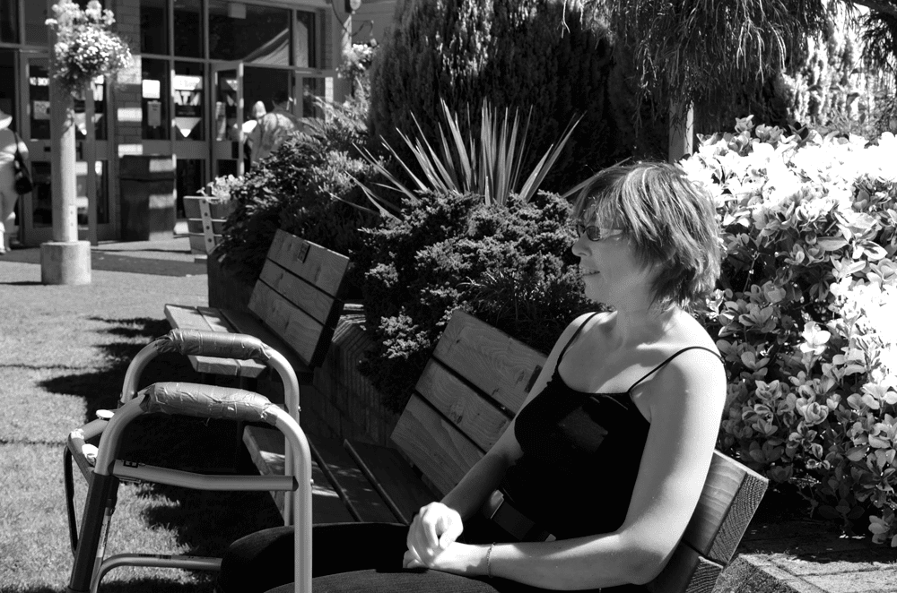
Black and white adjustment layer sample photo - a snapshot turned into character portrait

I'm already quite a far way into my Photoshop refresher this summer. I thought I'd start off the blog with a sample of a colour photo that became black and white following some tips in the book Photoshop CC: The Missing Manual. This photo is a portrait of myself leisurely enjoying the Saanich Fair last year, taken by my mom or dad.

It's a chance to get to know me better! And it was a quite colourful photo indeed, which I thought would show character more eloquently in black and white.

First, the colour version:


Notice how the photo is full of colours, textures, highlights, and shadows. I also had a broken foot at the time and wanted to diminish the attention that lands on the walker, if possible.

After applying a black and white adjustment layer:


I adjusted the adjustment layer's sliders to allow shadows in the green foliage with limited highlights for that spiky plant, but also to maintain a healthy complexion in my skin. I wasn't trying to look younger - it just turned out that way because of adjusting greens and reds for the plants. As it turned out, my skin looks paler and I like that look for its contemplative qualities, rather than a more realistic texture, with flaws and all.

I was wearing a black camisole, and I believe it helps keep attention on the curved highlight on my arm, leading up to the face. The viewer's gaze, in my opinion, scatters into the nearby interesting plant life, and hopefully wraps around to the face again.

When I look at this photo, my eye occasionally glances over to the walker but quickly back again, to a focused gaze on my face. It's like I wonder what the story is behind the walker, and my eye looks back to ... my eye I guess... to find the answer. But it doesn't get resolved in this photo. I don't look unhappy here, which is my typical character despite having a broken foot at the time.

Meanwhile, I'm pleased with this black and white treatment of an otherwise busy snapshot. The black and white adjustment layer offers help for distinguishing a point of interest and for highlighting a limited portion of its environment. In turn, this helps the viewer enjoy the photo, and explore pieces in sequence, and maybe more deeply each time.